02The Screener
The screener is the main tool. It starts from a universe of 8,000+ US stocks and filters down by fundamentals, options quality and assignment risk, then ranks what survives. Open the Screener and you'll see the market health banner, a single row of controls, and the ranked table — all in one view. Every filter lives behind the Open Filters button, covered in the next section.
Just above the table is a count line reading something like “200 of 2,779 stocks · 2,426 with tradeable options.” That's worth understanding: the first number is how many rows are being displayed, the second is how many passed your filters, and the third is how many of those actually have an options chain you could trade. A stock with no tradeable options is not a wheel candidate no matter how well it scores. If a technicals filter is active you may also see “N without technicals” — names excluded because we don't have chart data for them yet rather than because they failed, which is usually a recent listing.
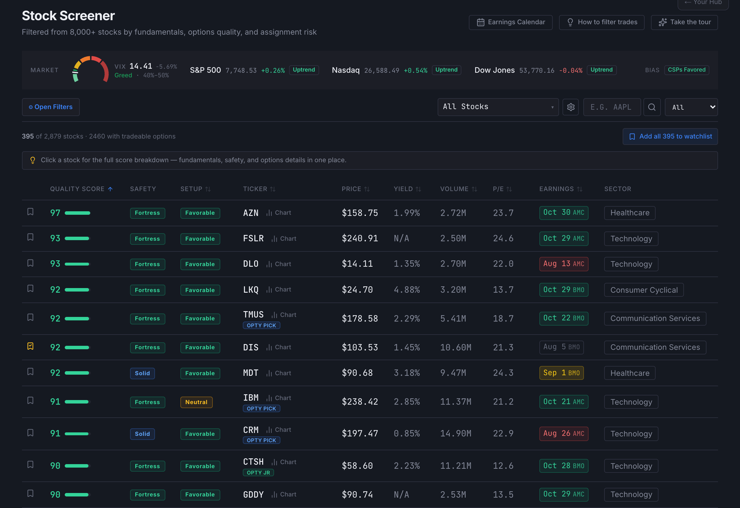
What each column means
The default view is quality-first — it answers “is this a good company?” before it answers “are the options rich?” The options-specific columns are one toggle away and covered in the next section.
| Column | What it shows |
|---|---|
| Quality Score | 0–100, with a coloured bar. A fundamentals-weighted read of the underlying company — would this be a solid business to own long-term? Built from roughly fifteen scored factors including profitability, P/E, earnings growth and trajectory, analyst consensus, 52-week position, beta, financial health, Piotroski F-Score, bankruptcy risk, Graham valuation, dividend sustainability, and revenue/cash-flow health. Click any row to see every factor and the points it earned. Deliberately distinct from the detail view's Options Grade, which scores options suitability only — the two are allowed to disagree. |
| Safety | A badge summarising a set of pass/fail balance-sheet checks: Fortress (every check passed), Solid (all but one), Caution (all but two), Danger (worse than that). Some conditions override the count outright — an unprofitable company, one burning cash, ATM IV above 100%, or a solvency reading in the distress zone will cap or drop the badge regardless of how many other checks pass. |
| Setup | Favorable / Neutral / Unfavorable — how aligned current conditions are, scored out of 40 across four pillars: Quality (fundamentals), Valuation (P/E versus the sweet spot), Momentum (200-day moving average and 52-week position), and Sentiment (analyst consensus). Favorable is 28 or above, Neutral 16–27, Unfavorable 15 or below. It is a read of conditions, not a recommendation. |
| Ticker | The symbol, plus a Chart button that opens a full-screen chart without leaving the screener. Cross-reference badges (OPTY PICK, AI WEEKLY, and so on) appear here when Opty is tracking the name — see below. |
| Price | Current market price. |
| Yield | Annual dividend yield, or N/A. Not required for the wheel, but a bonus if you end up holding shares. |
| Volume | Average daily share volume. Higher volume generally means tighter option spreads and easier fills. |
| P/E | Price-to-earnings ratio. Lower is cheaper relative to earnings. |
| Earnings | The next report date AND whether it lands before the open (BMO) or after the close (AMC) — the timing changes what you can do about it. Colour-coded by proximity: red when the print is close, green when it is comfortably far out, grey once the company has already reported. |
| Sector | The company’s business sector, useful for spotting concentration. |
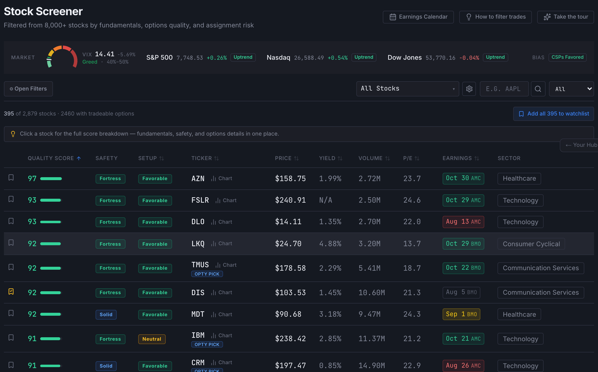
The Options overlay
The columns above describe the company. To see the options, open the filter panel and switch Options data on — it sits at the top of the Options group. It adds five more columns and unlocks the filters that depend on them. It defaults on for the curated wheel lists and off everywhere else, which is why the general view looks fundamentals-only until you ask for more.
| Column | What it shows |
|---|---|
| IV | At-the-money implied volatility — the absolute size of the premium being paid. Higher IV means richer premium in dollar terms. |
| IV Rank | Where the current IV sits inside its own 52-week range, 0–100. Formally: (current IV − range low) ÷ (range high − range low). The range is winsorized — single-day outliers are clipped so one freak print can't compress the whole scale — and the bounds always snap back to a day that genuinely happened. High rank means premium is rich relative to this stock's own history, which is a different question from whether it is rich in absolute terms. |
| AQ | Assignment Quality, 0–100 — how comfortable you would be holding the shares if assigned. Weighted more heavily toward profitability, balance sheet, and drawdown discipline than the Quality Score is. |
| WR | Wheel Readiness, 0–100 — a pure options-side score, independent of whether the company is any good. Premium-rich IV is 30% of it, tight spreads plus deep open interest 50%, and the absolute IV level 20%. A high WR means the chain itself is good to trade right now. Shows a dash when there isn't enough options data. |
| Tier | Wheel Tier A / B / C — a live snapshot of options conditions. A means high IV rank (≥50) and rich IV (≥40%), the maximum-premium environment. B is moderate (IVR ≥30, IV ≥25%). C is entry-level. |
Column sets change with the list
The screener swaps its column layout to match what you're looking at. The general overview and buy-and-hold lists lead with fundamentals and hide the options columns; the curated wheel lists show them by default; dividend lists foreground yield, payout and streak; growth lists foreground growth metrics. If a column you expect isn't there, the list preset is usually why — and the Options data switch in the filter panel overrides it.
Sorting the table
Click any column header to sort; click again to reverse. The small arrows next to each header show which column is active and in which direction. The default is Quality Score, highest first.
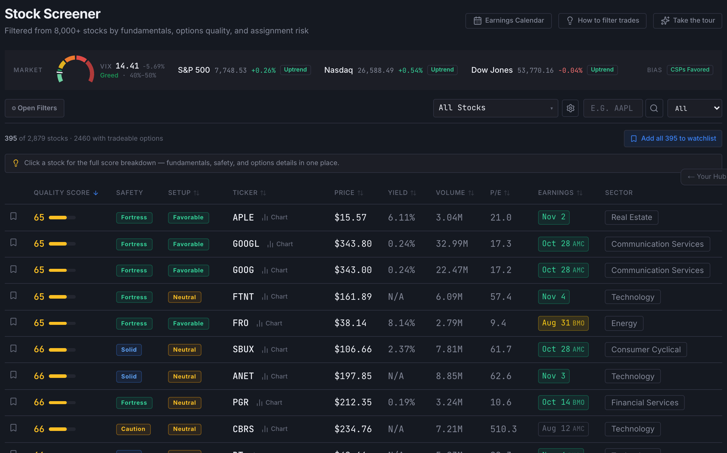
Market Health banner
At the top of the screener, the Market banner shows the VIX plus the level, day change and trend state for the S&P 500, Nasdaq and Dow Jones. Each index is classified with EMA Ribbon logic — five exponential moving averages (8, 13, 21, 34, 55) checked for stacking order:

- 📈 Uptrend— the EMAs are stacked fast-above-slow. That index is trending up, and pullbacks in it have more often resolved upward.
- ↔ Sideways— the EMAs are mixed or crossing. No clear trend either way.
- 📉 Downtrend— the EMAs are stacked slow-above-fast. That index is trending down, and a pullback is less reliably a dip.
The Bias badge on the right summarises those three into one line — for example “Cautious — Use Lower Deltas” when the indices disagree with each other. It describes the current regime and nothing more: it has no effect on any individual stock's score, signal or strike levels, and it isn't an instruction. Note the indices frequently disagree — it is entirely normal to see one index trending up while another trends down on the same day.
03Using filters
Every filter lives in one place: the Open Filters button at the top left of the screener. It opens a panel on the right holding everything, grouped by what the data actually is. Nothing is applied by pressing a button — the table updates the moment you change a setting.
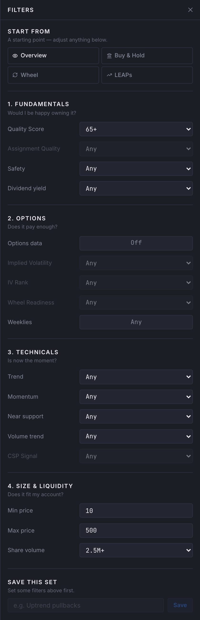
Start from a strategy
At the top of the panel is Start from — four starting points rather than a blank slate. Wheel sets a quality floor, an IV Rank floor, an assignment-quality floor and a liquidity floor, then sorts by Wheel Rank. Buy & Hold raises quality and drops the options gates entirely. Pullback looks for quality names dipping inside an uptrend — a classic setup for long-dated calls. Neutral is the neutral view — everything, ranked by quality, no strategy gates.
Whatever a strategy sets appears as a chip you can see and change. It is a starting point, not a mode — adjust anything underneath and the chips update with you.
The four groups
Filters are grouped by the question they answer, so you never have to remember which box a setting lives in.
| Group | Asks | Contains |
|---|---|---|
| 1. Fundamentals | Would I be happy owning it? | Quality Score, Assignment Quality, Safety, Dividend yield |
| 2. Options | Does it pay enough? | Options data switch, Implied Volatility, IV Rank, Wheel Readiness, Weeklies |
| 3. Technicals | Is now the moment? | Trend, Momentum, Near support, Volume trend, CSP Signal |
| 4. Size & liquidity | Does it fit my account? | Min price, Max price, Share volume |
Fundamentals
| Filter | What it does | When to use it |
|---|---|---|
| Quality Score | Minimum overall company score, 0–100. | Raise it to concentrate on the strongest businesses. Lower it if you are deliberately hunting turnarounds and will judge safety yourself. |
| Assignment Quality | Minimum AQ — how comfortable the company would be to own if the put is assigned. | The filter that matters most if assignment is a real outcome for you rather than a theoretical one. Needs the Options switch on. |
| Safety | Minimum Safety badge — Caution, Solid or Fortress. | A balance-sheet floor. Fortress is strict enough to shrink the list quickly; Solid is the usual working setting. |
| Dividend yield | Minimum trailing annual yield, or simply “pays a dividend”. | On a wheel the dividend keeps paying while you hold assigned shares waiting for the covered call to work — two income streams on the same capital. |
Options
The first control in this group is the Options data switch. It adds the options columns to the table and enables the filters below it. While it is off, those filters are greyed out and say so — a filter that cannot run should never look like it is running.
| Filter | What it does | When to use it |
|---|---|---|
| Implied Volatility | Minimum ATM implied volatility. | Sets a floor on absolute premium — the size of the cheque, regardless of whether it is unusual for that stock. |
| IV Rank | Minimum IV Rank — where IV sits inside that stock’s own 52-week range. | Sets a floor on how unusual the premium is for that specific name. Pairing the two — say IV 40%+ with IVR 50+ — finds premium that is both large and historically rich. |
| Wheel Readiness | Minimum WR — the options-side score. | Spread width and open interest are half its weight, so a floor here filters out chains that look rich but are hard to fill. |
| Weeklies | Restricts to underlyings with weekly options listed. | Doubles as a liquidity screen — see below. |
Technicals
The first three groups tell you whether a stock is worth owning and whether its options pay. Technicals answer a different question: is this a sensible moment on this particular chart? They are computed nightly from a year of daily bars.
| Filter | What it does | When to use it |
|---|---|---|
| Trend | Uptrend / not in a downtrend / above the 200-day / in a downtrend. Read from the EMA ribbon — the same calculation that colours the candles on the ticker chart, so the filter and the chart always agree. | Selling puts into a confirmed downtrend is the most common way a wheel position turns into a long-term holding. “Not in a downtrend” is the single most useful setting here. |
| Momentum | Oversold (RSI ≤ 35), pulled back (below the 20-day average), not extended, or overbought (RSI ≥ 65). | Selling into a pullback pays more than selling into a stock that just ran up — same company, better price. Overbought is the covered-call end of the same axis. |
| Near support | Within 3%, 5% or 10% of the nearest price level the stock has bounced off before, found by clustering swing lows across the past year. | Speaks directly to strike placement: a level price has held before sits below where you would typically set a put strike. |
| Volume trend | Recent 5-day average volume against the 20-day average. | Confirmation. Above-average volume means the current move has real participation behind it. |
| CSP Signal | The composite timing verdict — the same green / yellow / red read shown on the ticker chart. | The shortcut. It folds every indicator above into one verdict, so “Green only” is the fastest way to a shortlist. Needs the Options switch on. |
Size & liquidity
Min and Max price set the share-price range, which in practice sets your capital per contract — a cash-secured put needs the strike × 100 in collateral, so a $400 stock ties up roughly $40,000. Share volume is a liquidity floor on the underlying itself; thin volume usually means wide option spreads, which quietly costs more than it looks like on screen.
The Weeklies filter
Set Weeklies to Only and the table drops any underlying without weekly options listed. It looks like a filter about expiry choice, and it is — but the more useful thing it does is act as a liquidity screen you didn't have to build.
Exchanges don't list weeklies on request. They grant them based on sustained volume and open interest, which means the exchange has already done a liquidity assessment on your behalf. A weekly-listed name therefore tends to carry finer strike increments, tighter bid-ask spreads, and more expiries to roll into — and those three things matter on a 30–45 DTE position just as much as on a weekly one, because they decide what it costs you to adjust or exit.
That makes it a reasonable first filter even when you have no intention of trading a weekly expiry. Share volume tells you the stock is liquid; the presence of weeklies tells you the options are.
Chips: reading your own query
Every filter you set appears as a chip beside the Open Filters button — Quality 85+, Trend Uptrend only, and so on. Click the ✕ on a chip to remove that one filter, or Clear to drop them all. Filters at their default don't render a chip, so the bar always shows your query rather than the app's full list of capabilities.
This matters more than it sounds. A filter you set last week and forgot about is indistinguishable from a broken screener — the chips exist so a short list always explains itself.

Saving a set you like
At the bottom of the panel is Save this set. Name the filters you've built and they're stored to your account, so they follow you to any browser you sign in from. Saved sets then appear in a dropdown next to the Open Filters button — which only shows up once you have at least one.
A saved set stores the filters and whether the Options switch was on. It deliberately doesn't store your sort order or row limit, since reapplying a set shouldn't reorder the table you're looking at.
Choosing what you're looking at
To the right of the filter chips is the scope picker — one dropdown covering everything the table can be pointed at. It has collapsible sections and a filter box at the top, so you can type a few letters instead of scrolling.
- All Stocks — the full qualifying universe.
- Indexes & ETFs and S&P 500 — benchmark sets.
- Wheel Kings — the curated wheel lists by price band, plus High Premium and Fallen Angels.
- Power Lists — Opty AI Watchlist, Buffett Quality, CANSLIM Growth, Dividend 50, Deep Value 50.
- Sectors — narrow to a single sector.
- My Lists — watchlists you've saved.
Picking a sector clears the list you were on and vice versa — they answer the same question, so only one applies at a time. Beside the picker, the Symbol box filters as you type; clear it and you're back on the list you were browsing.
Curated lists come with their own criteria already applied by the nightly build — the panel lists them under already applied so you can see what a list has done before you narrow it further. You can filter on top of any of them and then use Add all to watchlist above the table to save the result as your own list — see Watchlists.
Which filters to use, and in what order
Everything above documents what each filter does one by one. It deliberately doesn't tell you which to reach for first — that's a recipe rather than a reference, and it has its own page: How to filter trades. A specific order of settings that takes the full list down to roughly ten candidates, with a button that applies all of them for you. You can reach it any time from the How to filter trades button in the screener header.
Cross-reference badges
Coloured badges next to a ticker mean Opty AI is tracking that stock in some capacity:
- OPTY PICK— in the current week's Opty Picks.
- OPTY JR— in the current week's Opty Jr picks, the lower-strike-cap tier.
- AI MONTHLY— the AI Trader holds an active monthly position.
- AI WEEKLY— the AI Trader holds an active weekly position.
The Opty AI Watchlist under Power Lists in the scope picker shows every name Opty is currently tracking in one place. The same badges appear on the curated watchlist pages, so wherever a ticker shows up you can see whether Opty is in it.
Quick Chart
The small Chart button beside every ticker opens a full-screen chart without leaving the screener, loaded with your last-used timeframe, chart type and indicators. Candle colours come from the EMA ribbon — green for an uptrend, red for a downtrend, amber for sideways — which is the same reading the Trend filter uses. Below the chart, two panels appear:
- CSP Entry Idea — a cash-secured put read: a Favorable / Neutral / Unfavorable verdict with the specific reasons behind it, then three strike reference levels (Conservative, Balanced, Aggressive) each with delta, OTM %, expiry, premium estimate, capital required and annualized return.
- CC Entry Idea — the covered-call side, same structure, shown alongside so you can read both legs of the wheel at once.
Signal data is cached per ticker, so reopening the same stock loads instantly. Open the full detail view from the row itself if you want it recomputed.